JT Pulpo
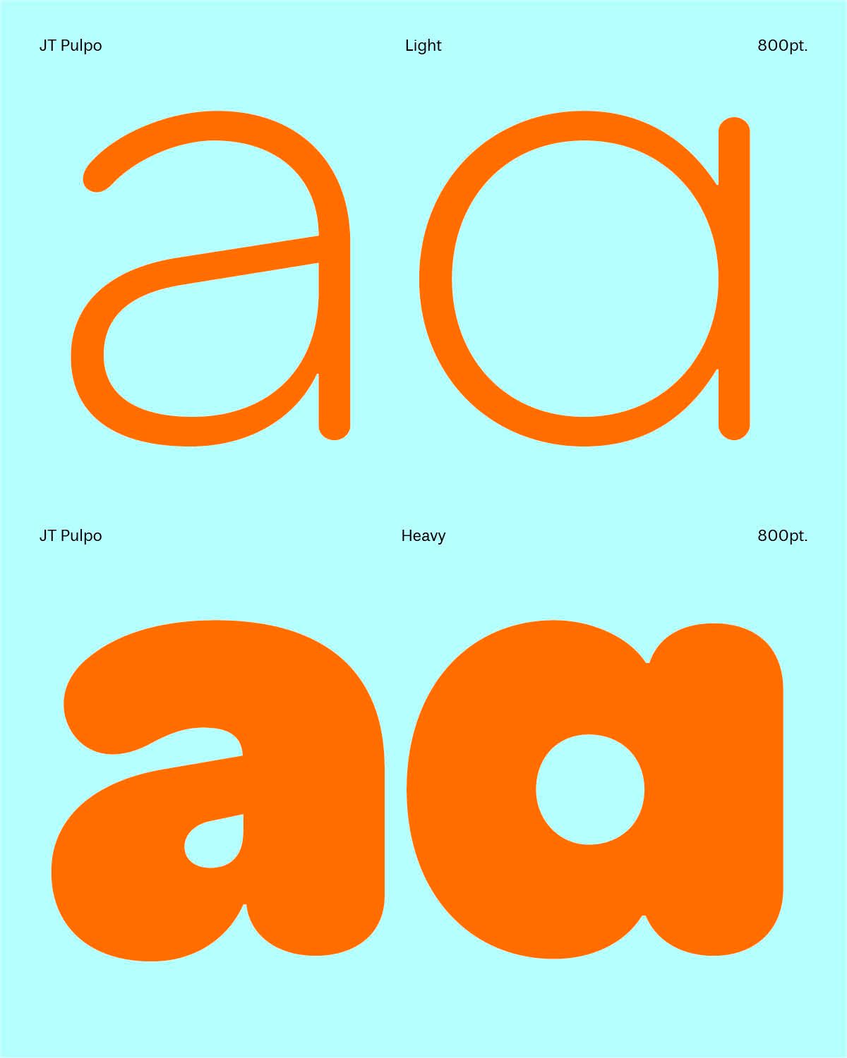
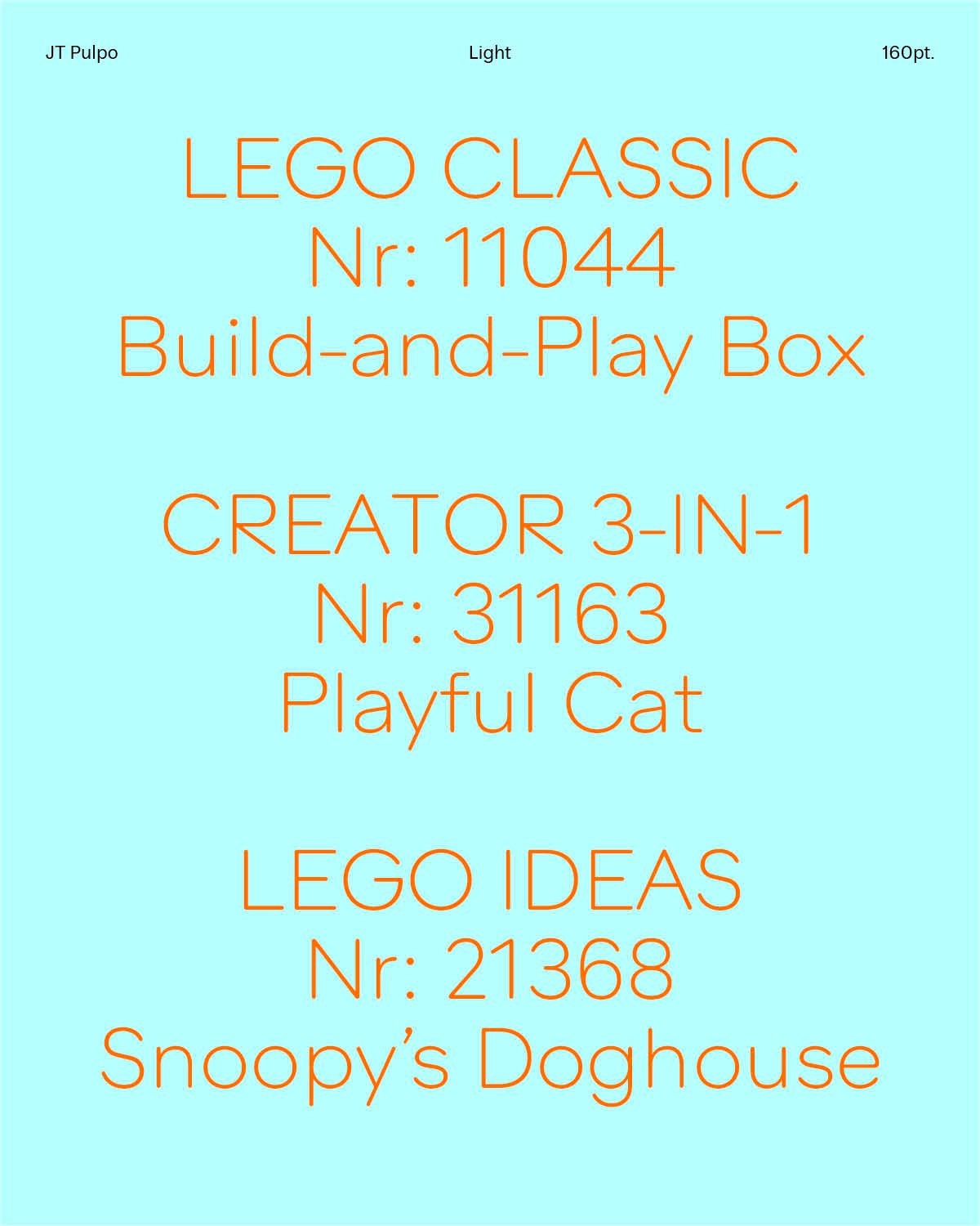
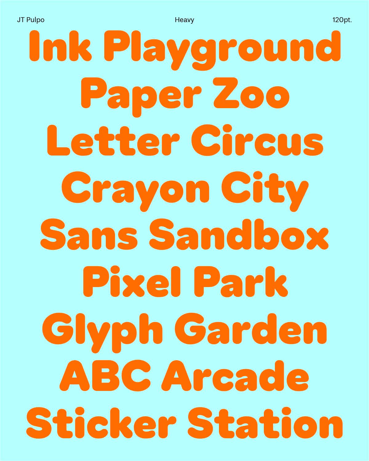
JT Pulpo is a geometrical typeface with soft edges, for everyday use with a gentle, softened character. Designed by Edward Dzulaj and Pauline Heppeler. Expected release date: November 2026
JT Pulpo is a geometrical typeface with soft edges, for everyday use with a gentle, softened character. Designed by Edward Dzulaj and Pauline Heppeler. Expected release date: November 2026

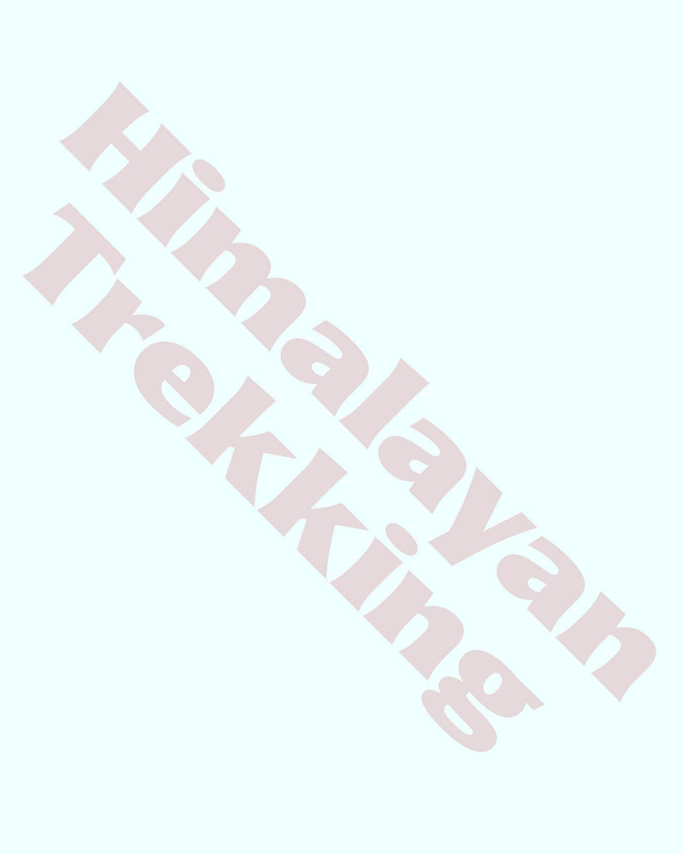
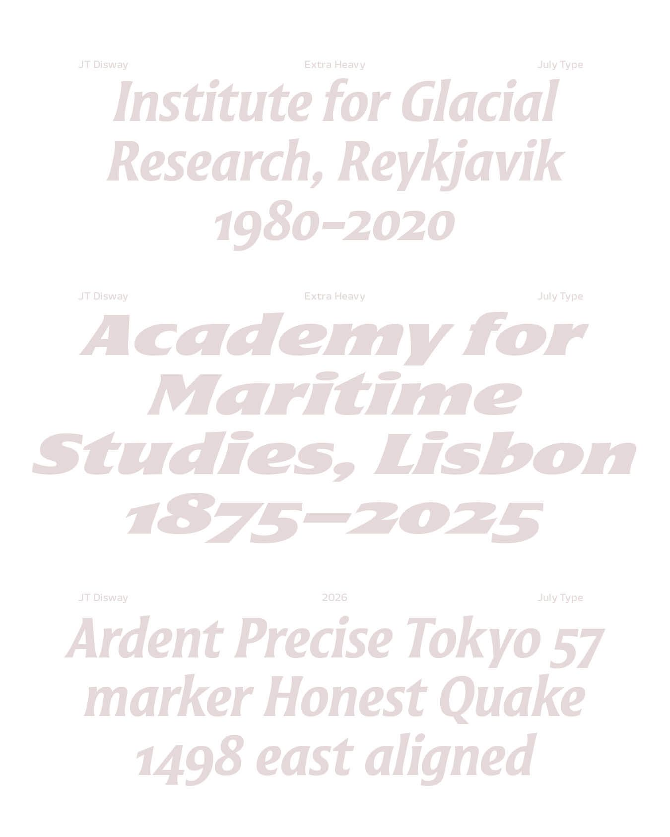


JT Disway designed by Pauline Fourest is a brush calligraphy-inspired typeface family, originally designed for low-budget, plastic-printed hiking signage. Optimized for a size of 20 pt and above, its translation contrast and flared serifs enrich the reading experience. It offers a taste of great adventures, in complete safety. Expected release date: September 2026
Request trial of JT Disway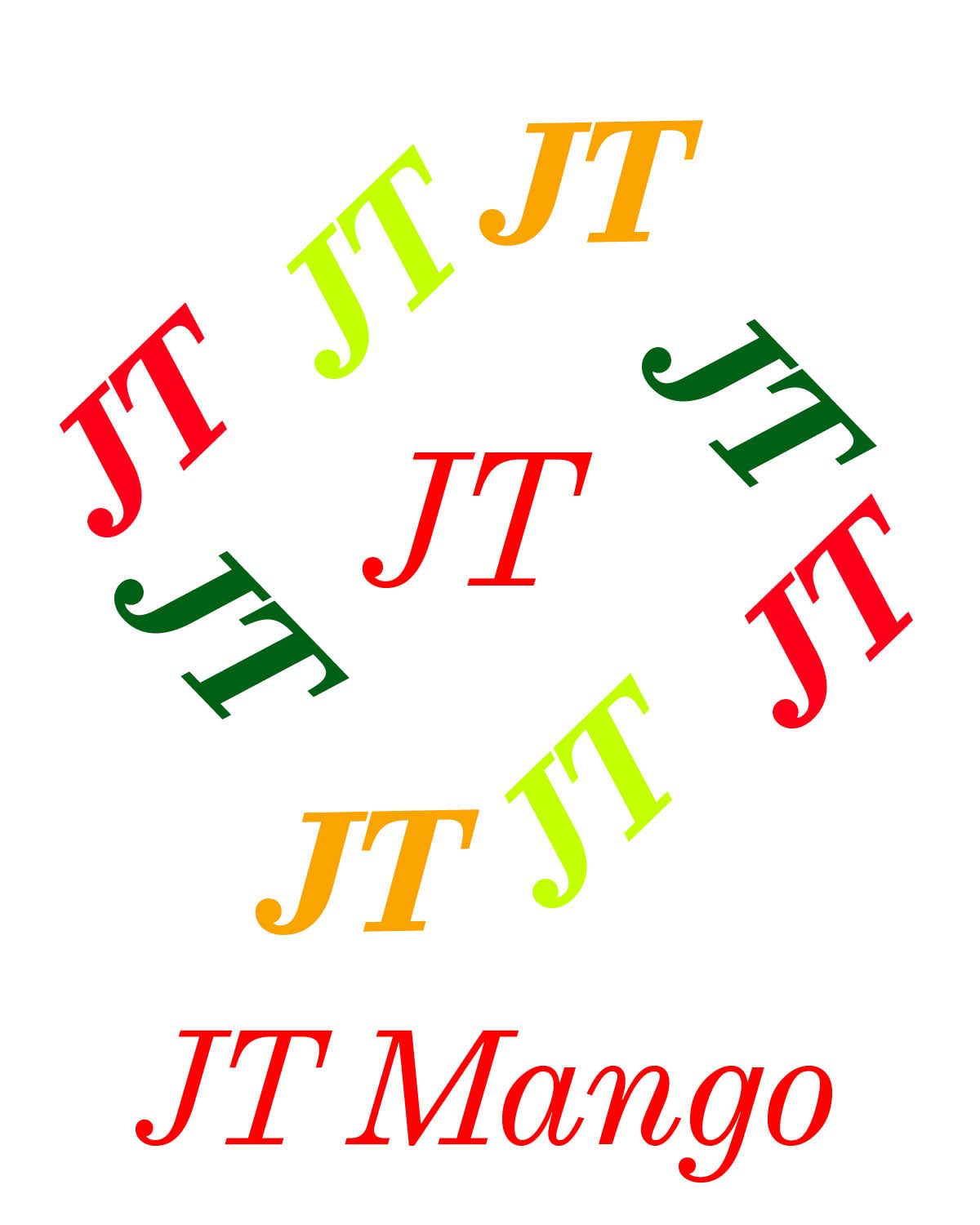
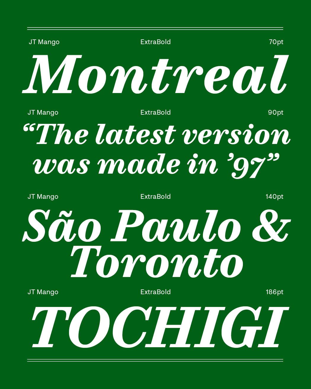
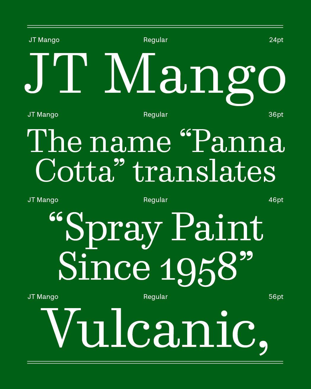
JT Mango is a contrast typeface designed for extended reading. It performs very well in long-form text, both on screen and in print. Expected release date: November 2026
Request trial of JT Mango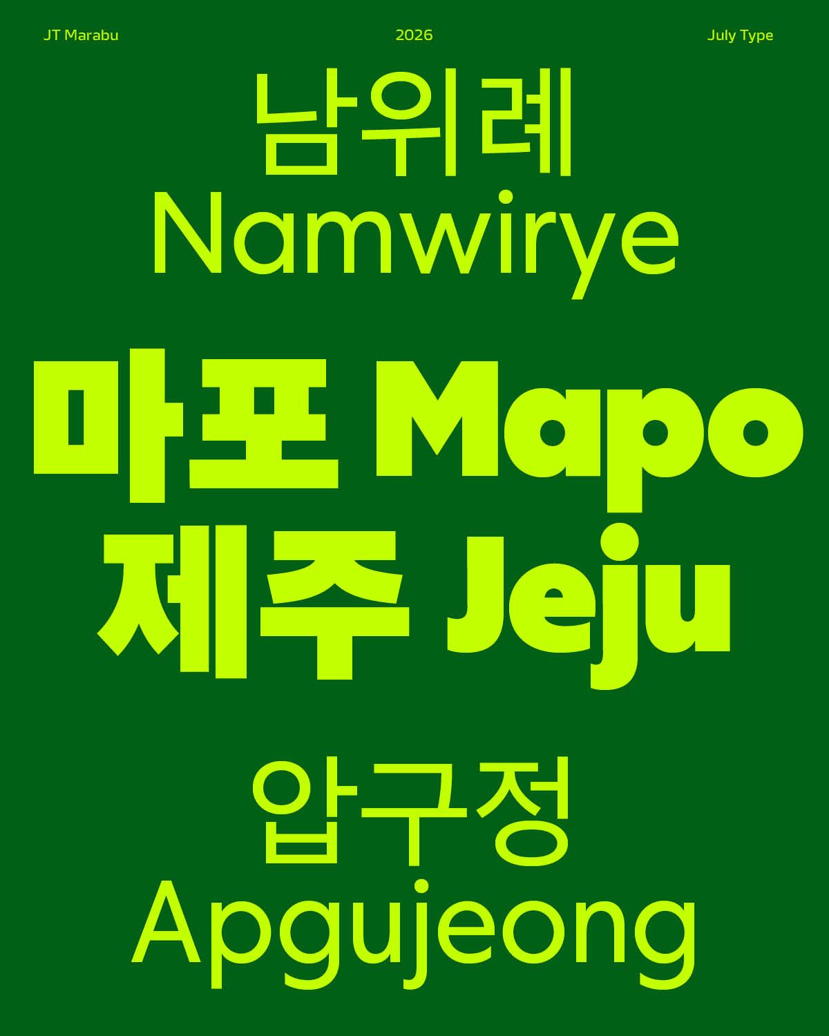
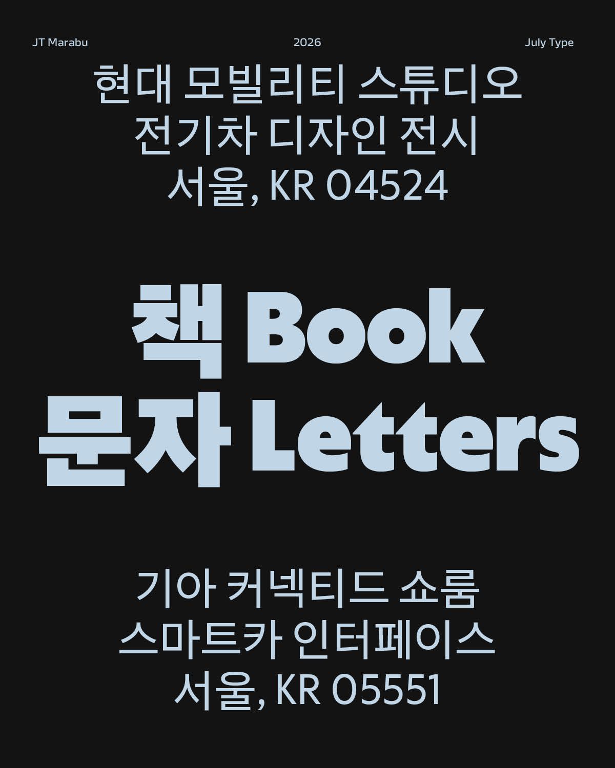
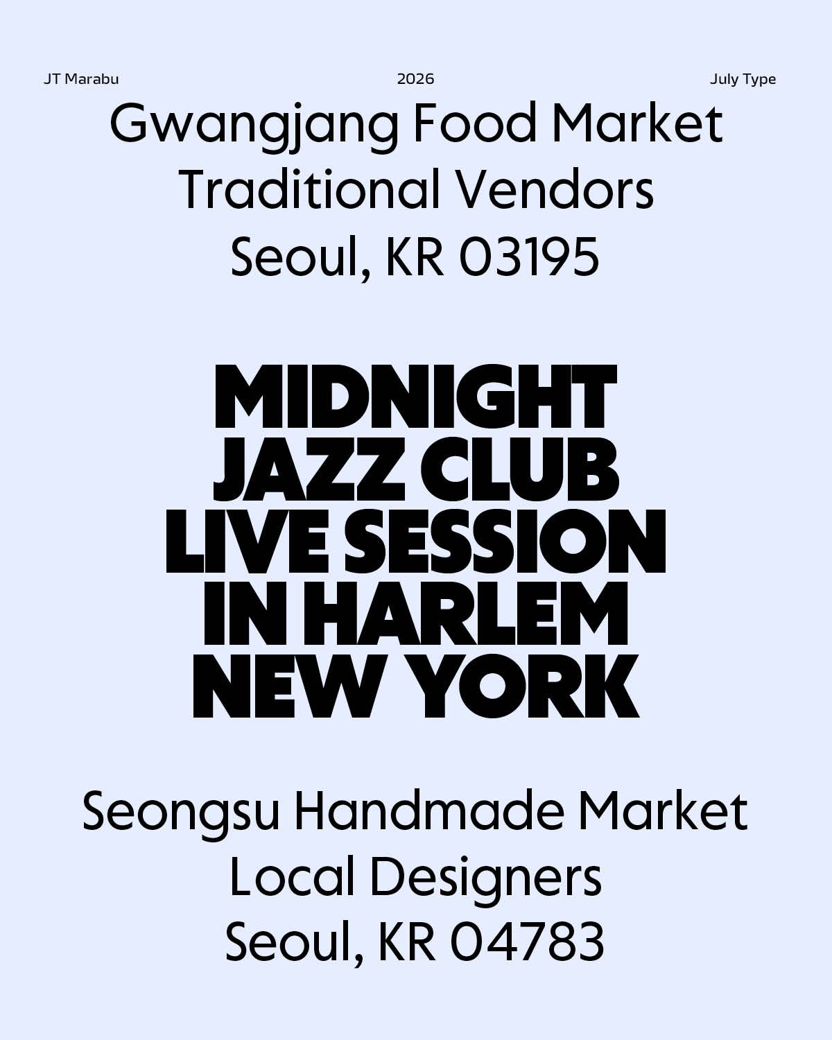
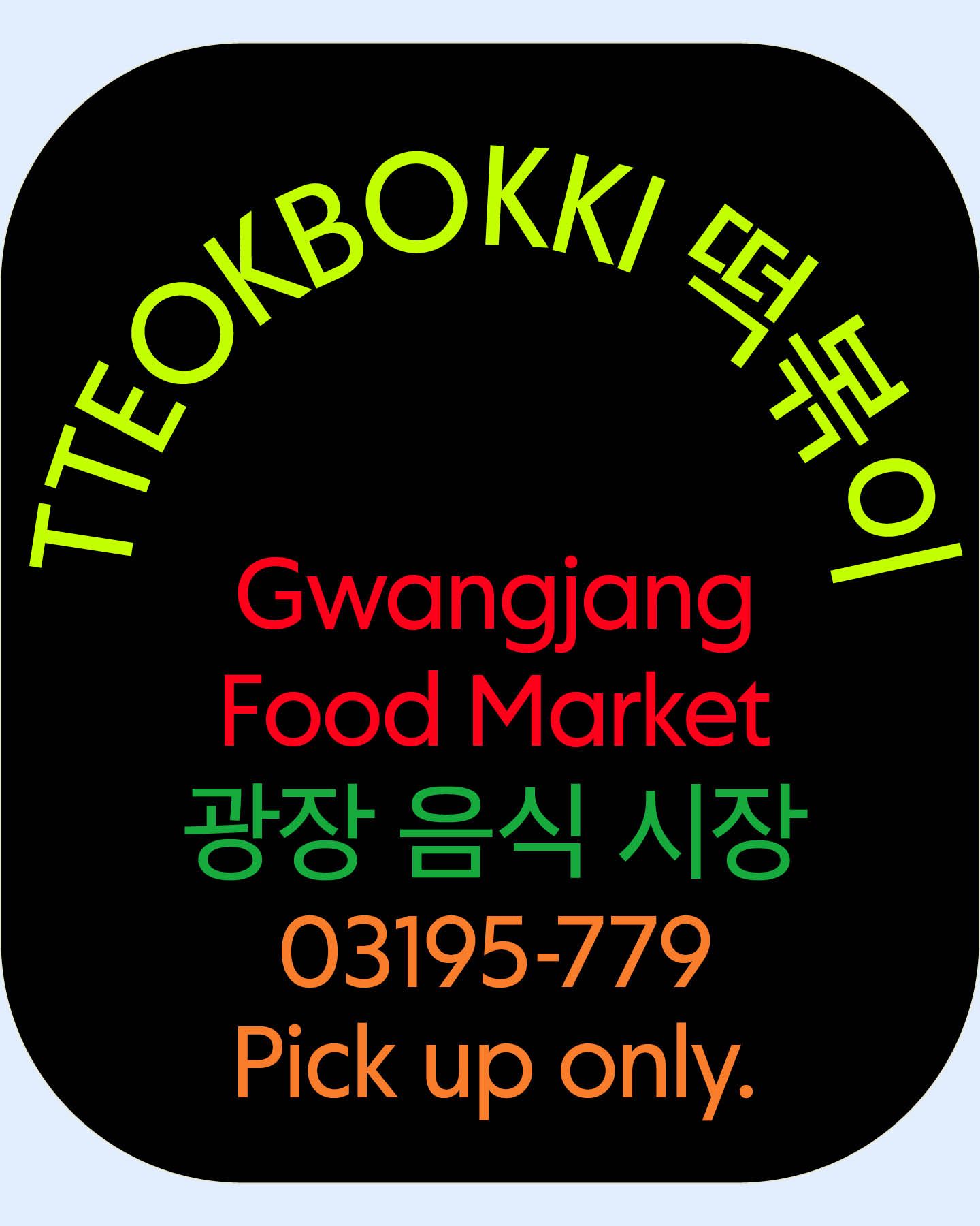
JT Marabu is a geometrical typeface with a humanistic touch. During the research phase, we explored the geometrical sans genre through posters, books, and old newspapers. The typeface was designed by Joohee Lee and Edward Dzulaj. Expected release date: January 2027
Request trial of JT Marabu
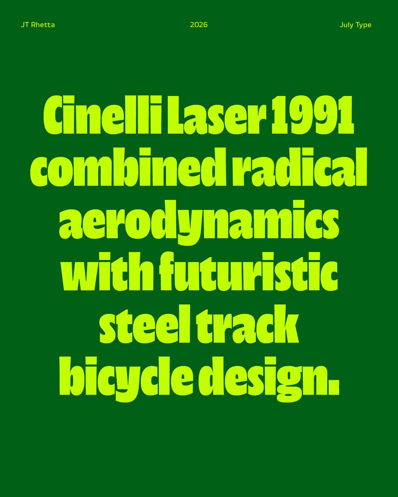
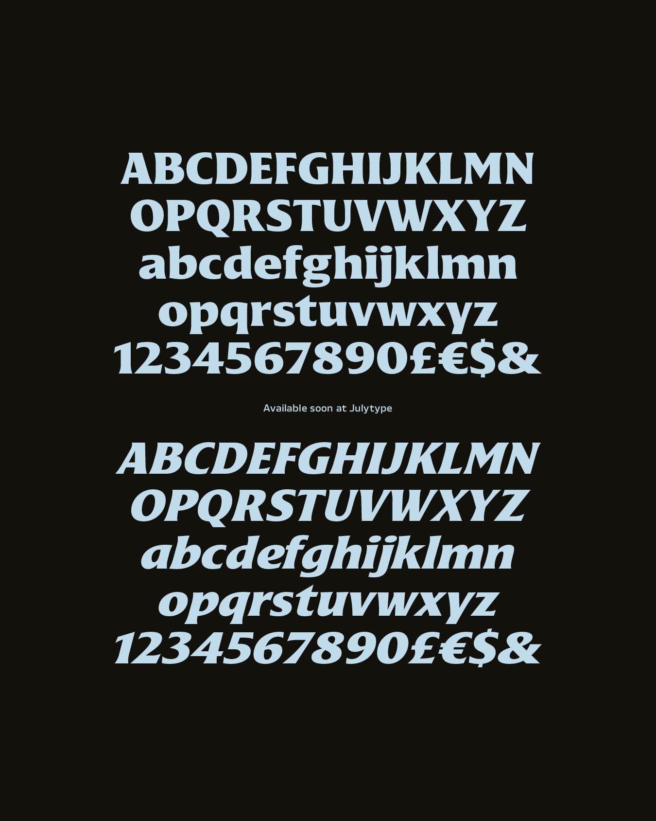
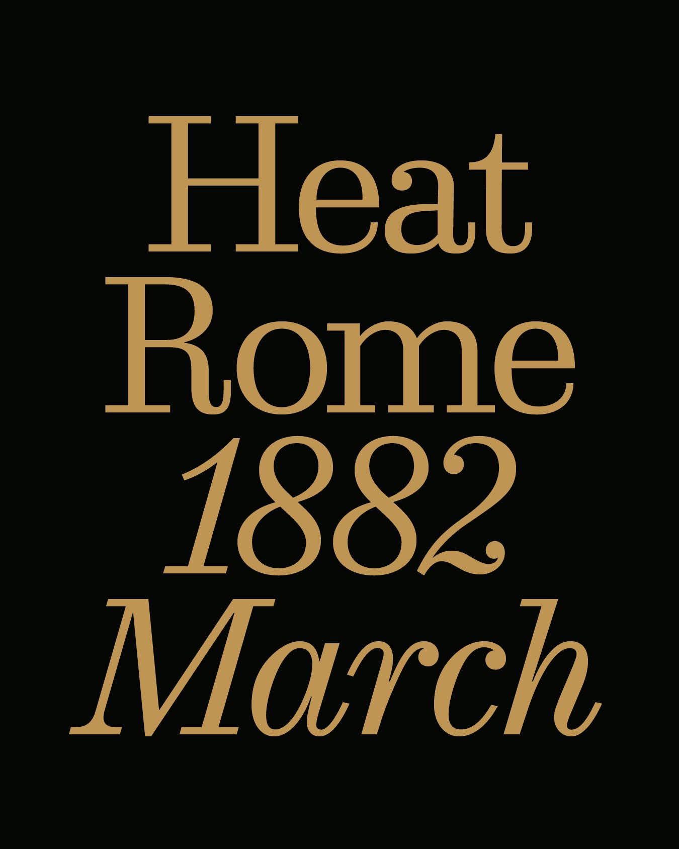
Rhetta is a typeface inspired by 40s-80s sci-fi pulp fiction novels. It is a typeface for books in the true sense. At one end, you have a range of weights for book covers. At the other end are text weights robust enough to handle the cheap paper. Both ends are interpolatable, meaning any point between them is accessible in a variable font. Expected release date: September 2026