JT Picolo featured in the identity of the Polish Pavilion at the 60th Venice Biennale.
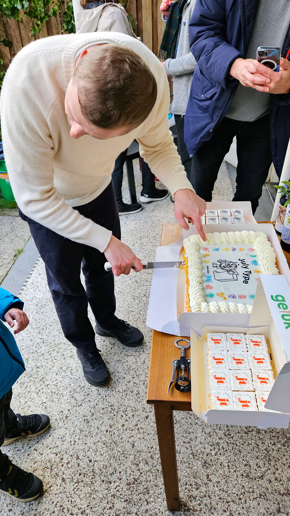
On April 20, 2024, we celebrated the official launch of our type foundry with a small gathering in The Hague. It was a meaningful moment to reflect on nearly a year and a half of dedicated work and to acknowledge the collective effort that brought the foundry to life. Prior to the launch, I invited a diverse team of friends designers Anna Moschioni and Hyeonjeong Kim; coder Nedislav Kamburov, my painter friend, Mateusz Kubiak, who brought our mascot, 'Globe,' to life" and two talented interns, Ngoc Mai and Stavros Gialamidis. Coming from a Polish-Ukrainian background, I was determined from the start to include Cyrillic script alongside Latin in the three fonts we prepared for the launch: JT Peleton, JT Picolo, and JT Multona. Adding Cyrillic was both a challenge and a rewarding experience, marking one of my first completed projects involving dual scripts.
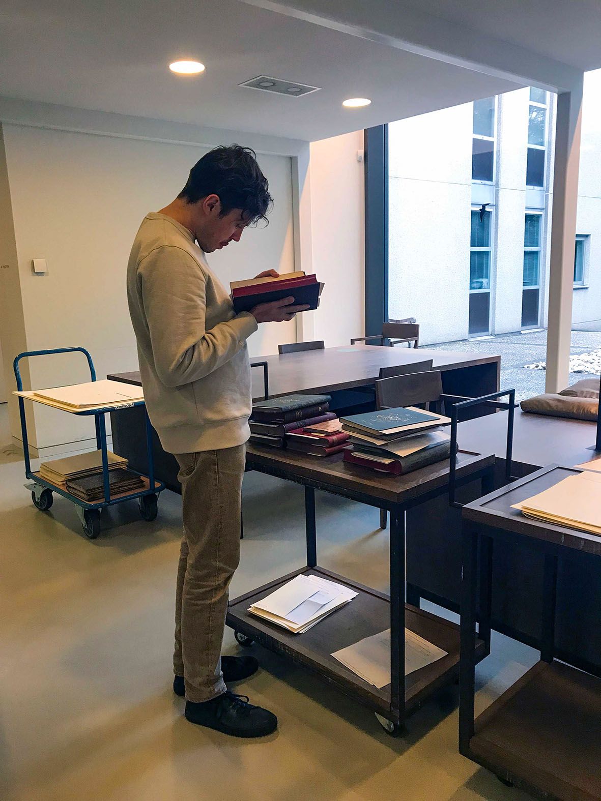
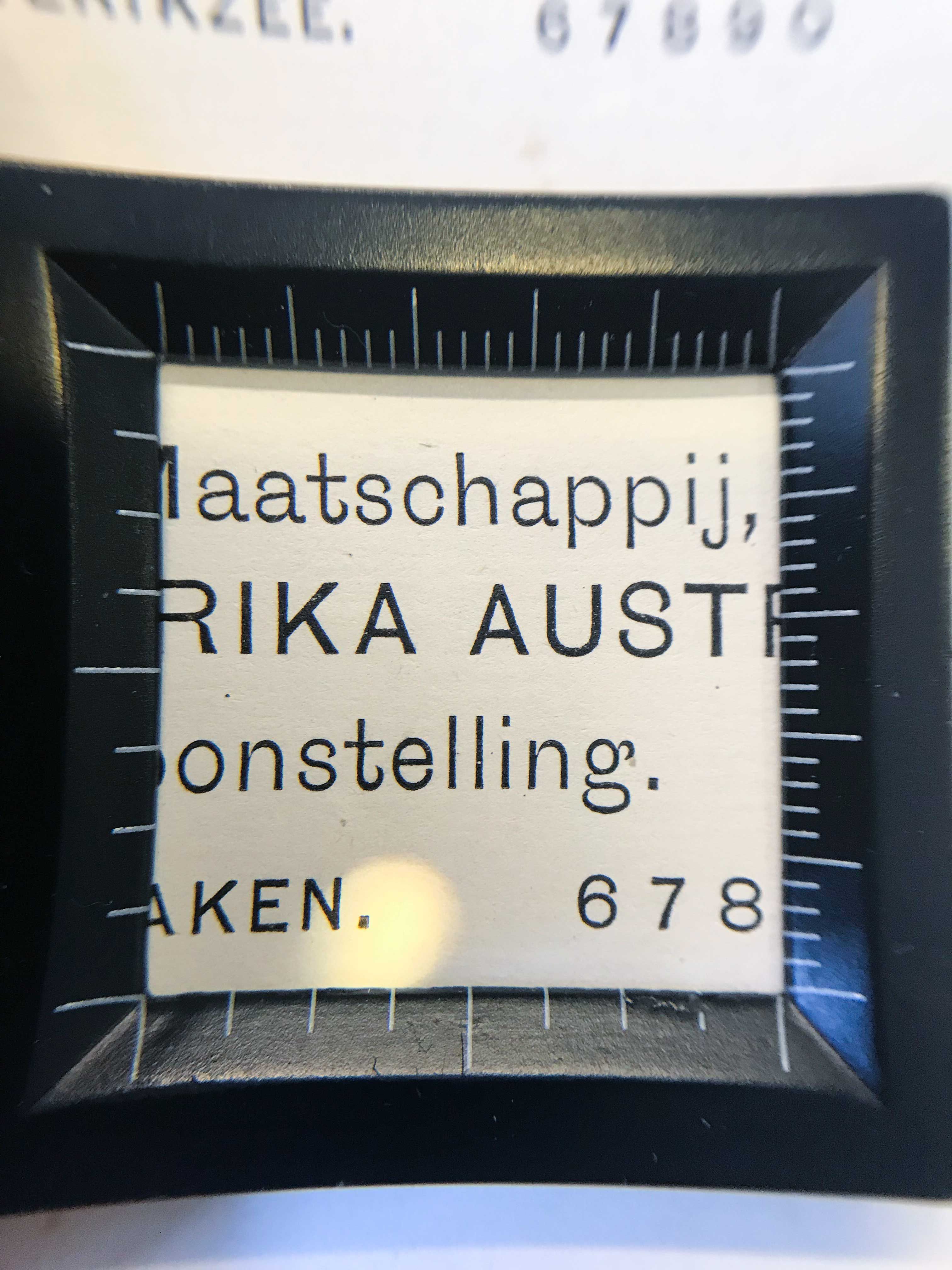
The roots of JT Picolo trace back to 2021, when my friend Risto Kujanpää and I, freshly graduated and eager to dive into new projects, visited the Noord-Hollands Archief in Haarlem, Netherlands. Our goal was to explore the rich history of 19th- and 20th-century type foundries, and, of course, to discover unexpected gems along the way. I had already begun my research into high-contrast 19th-century grotesque typefaces, so this visit was an opportunity to see if I could uncover more examples of this particular style. As is often the case with archival research, I was completely overwhelmed by the great number of type specimens and the exceptional craftsmanship of the metal type era. We lost track of how many books we went through, but one thing was certain—we had a delightful overdose of type. :–)
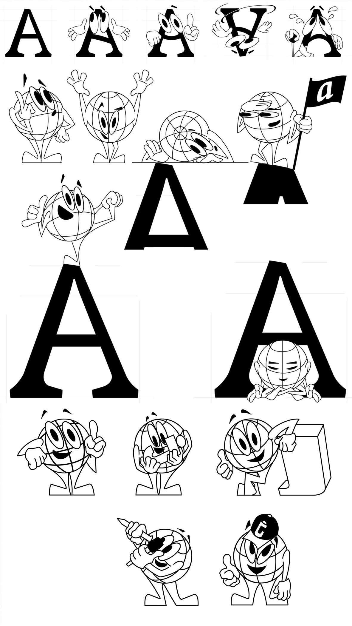
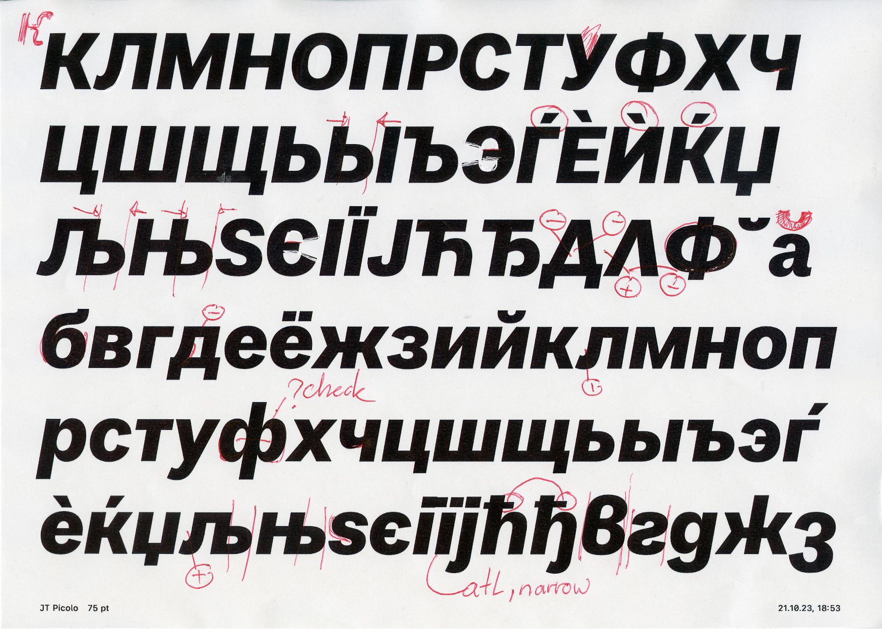
Back in the studio, I went straight to the drawing board. My initial sketches were inspired by some of the quirkier models I discovered, such as Breede Grotesque from Van der Wiel & Hooijer te Arnhem (1875) and its later iteration by the Amsterdam-based foundry Tetterode. From the start of designing JT Picolo, I knew I wanted to include Cyrillic. The two scripts needed to relate to each other, so I focused first on the Latin to build a strong foundation for the Cyrillic. One thing I definitely learned from this process is that time is key to refining and strengthening any design. Finding the right balance between expressive and subtle elements took time, but it was crucial to shaping the final result. Towards the end of the project, I invited two friends I met at Type & Media in The Hague, Anna Khorash and Nika Langosh, who contributed valuable corrections and feedback. They worked alongside our intern at the time, İbrahim Kaçtıoğlu, who primarily focused on the slanted styles. JT Picolo is a typeface with a generous x-height, subtly blending display elements inspired by historical sources, most notably the distinctive forms of the "r" and "g," which lean toward more expressive, display-oriented solutions. I kept the more expressive letterforms as alternates, which are more closely aligned with the historical examples, while the default set is somewhat more calm.
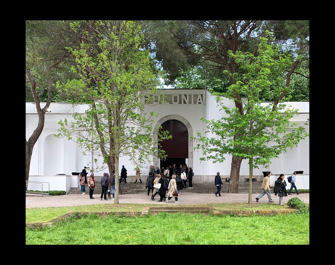
In early January 2024, Warsaw-based designer Jan Bersz reached out to us and express interest in using our fonts. He was working on a book to accompany the Polish Pavilion's identity and exhibition at the 60th Venice Biennale. I saw this as a great opportunity for JT Picolo’s first larger scale application, perfectly aligned with my original goal of designing the typeface to support both Latin and Cyrillic scripts. Jan introduced me to his collaborators, Jerzy Gruchot and Wojtek Koss from the Warsaw-based studio The Full Metal Jacket, who were responsible for the pavilion’s identity. For the book, Jan used our fonts JT Peleton for the running text alongside JT Picolo. The book was distributed at the Biennale, the Warsaw Zachęta Museum, and various art bookstores.
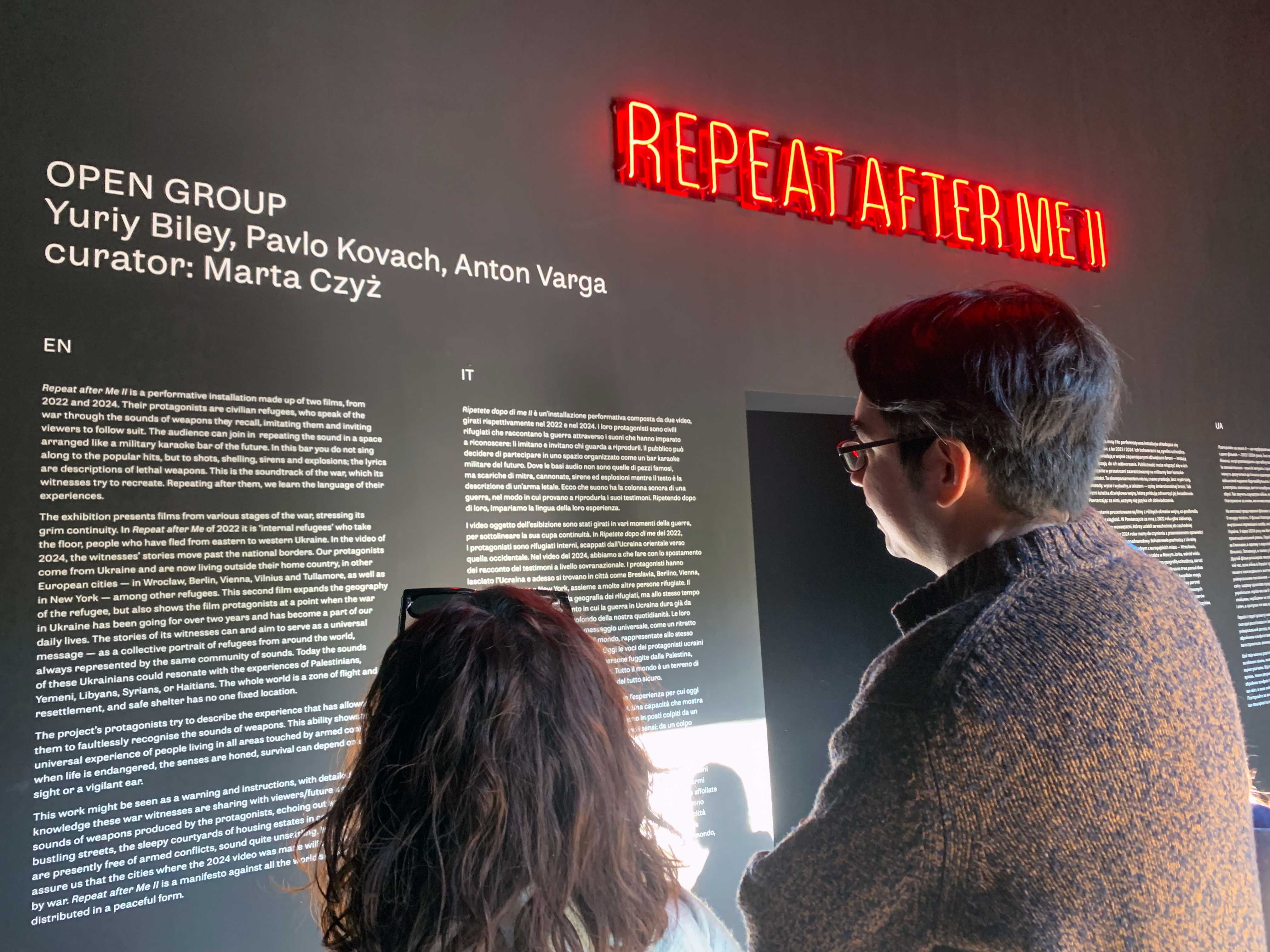
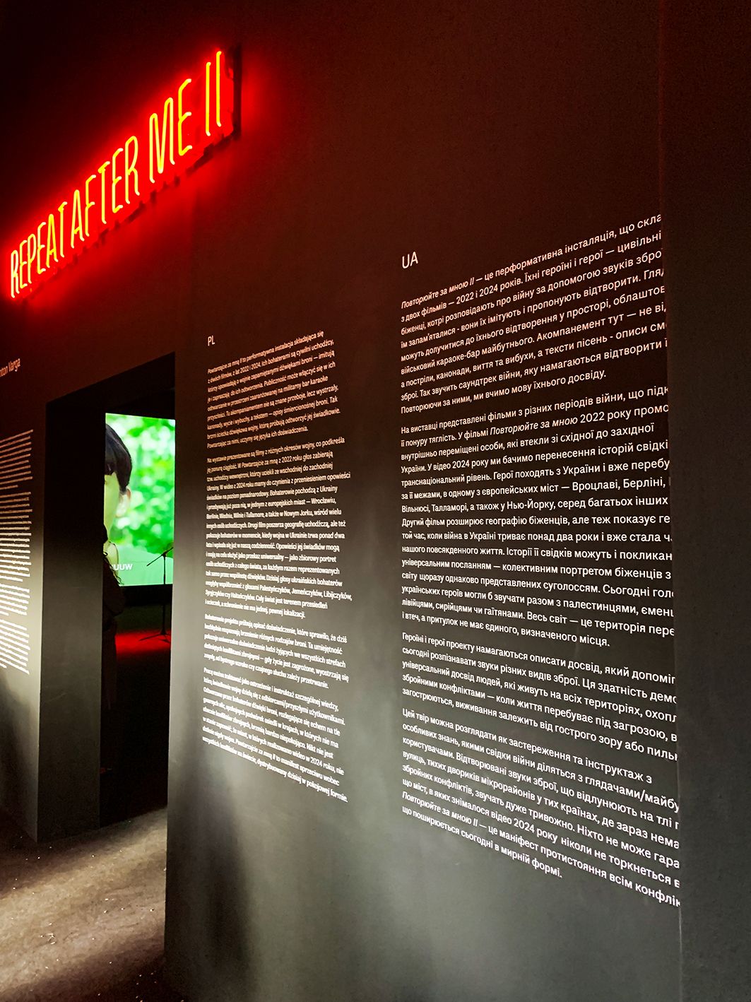
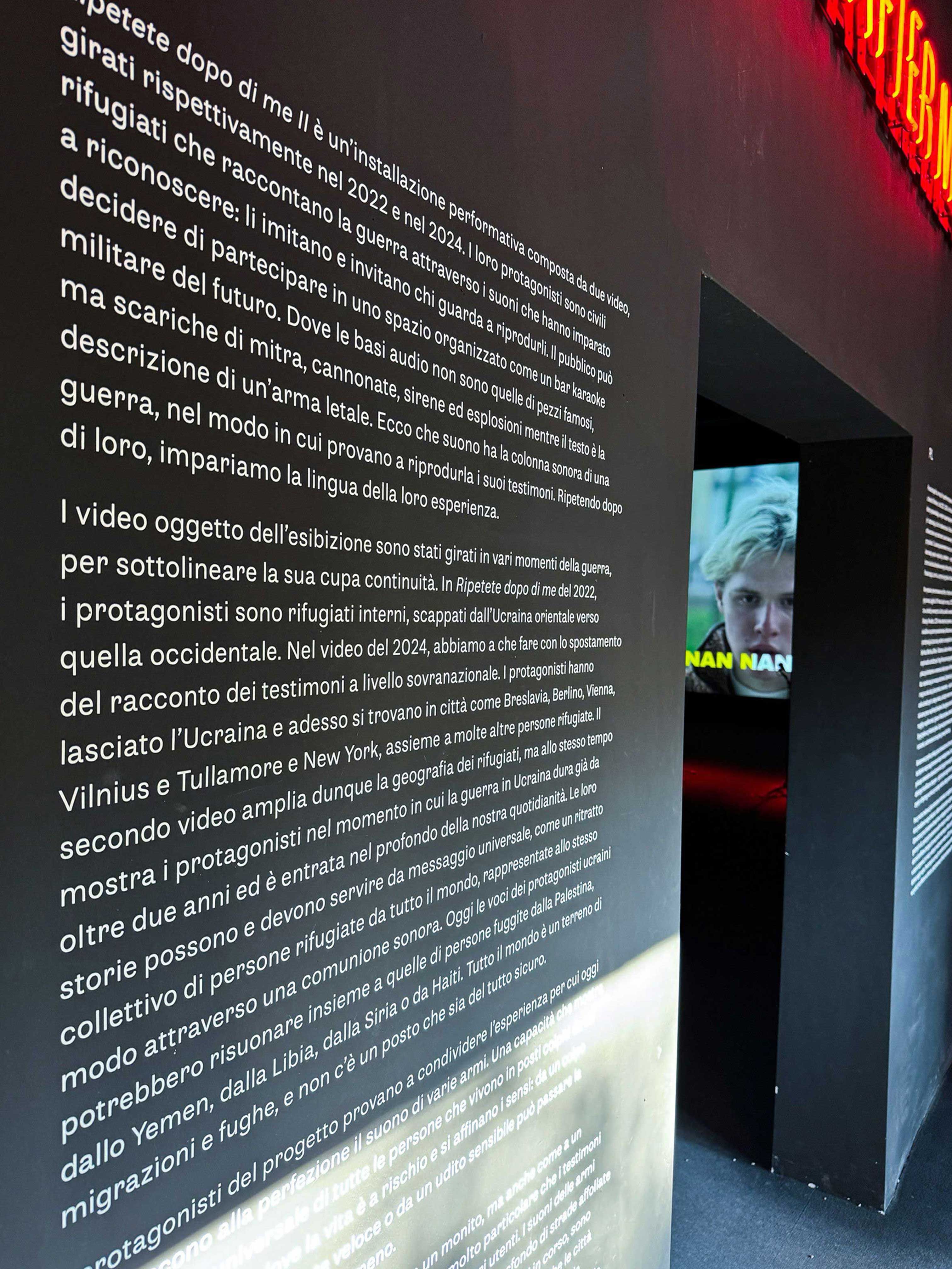
The Polish Pavilion project, titled Repeat After Me II, is an audiovisual installation by the Ukrainian Open Group collective. It explores the interaction between people and spaces in a performative and participatory way, with a poignant focus on the ongoing war in Ukraine. Through the format of karaoke, the piece presents civilian refugees describing the sounds of war—guns, missiles, explosions—and invites the audience to repeat these sounds. Filmed over two years (2022 and 2024), the installation juxtaposes the persistence of memory with the evolution of war technology. The project highlights war as a collective experience, urging viewers to confront its personal toll.
JT Picolo’s inclusion in the Polish Pavilion’s identity at the Venice Biennale was especially meaningful given the exhibition’s powerful exploration of human experience, pain, and tragedy during war. The pavilion’s project, Repeat After Me II, confronts the reality of war through sound and memory, making it an important and moving initiative. Language, songs, poetry and alphabet all and deeply connected to the national identity. I’m grateful that our typeface could play a role in a project with such profound significance. Слава Україні!