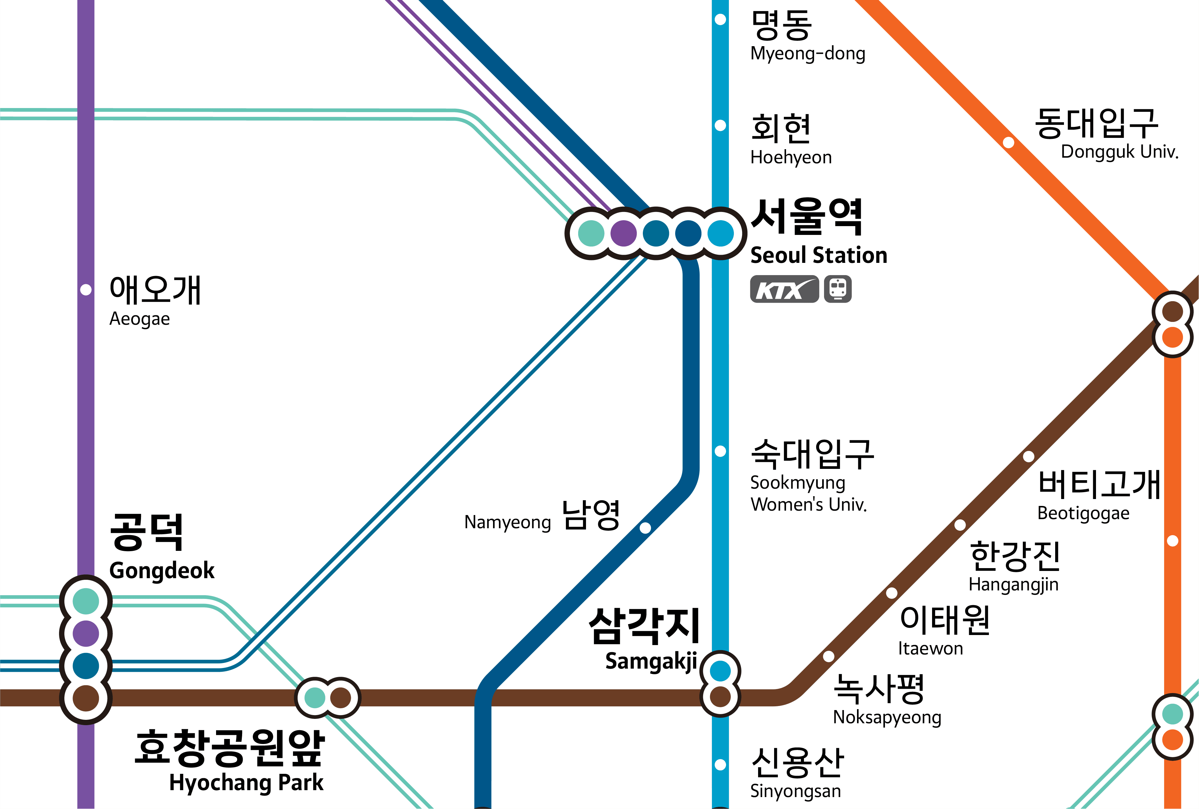
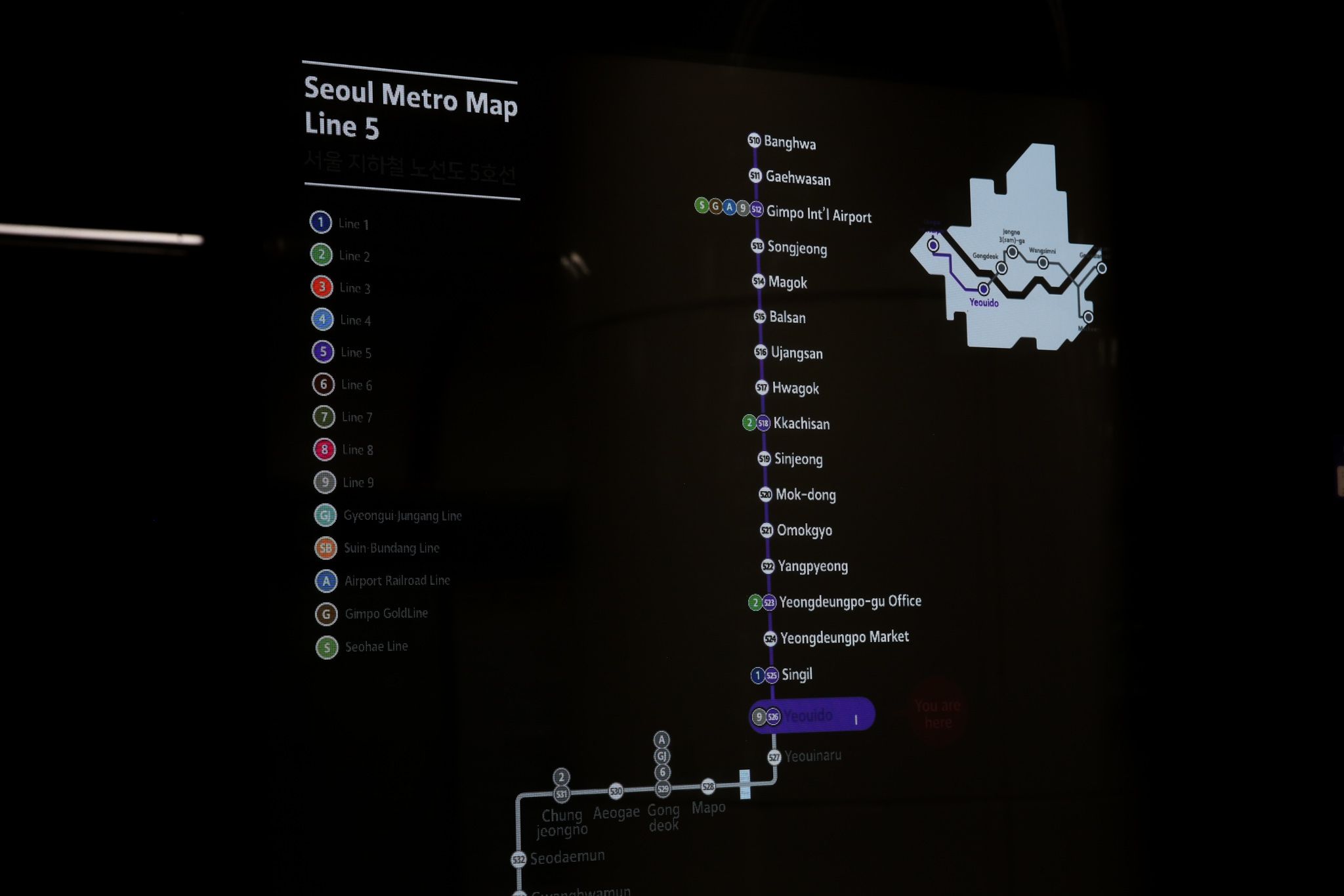
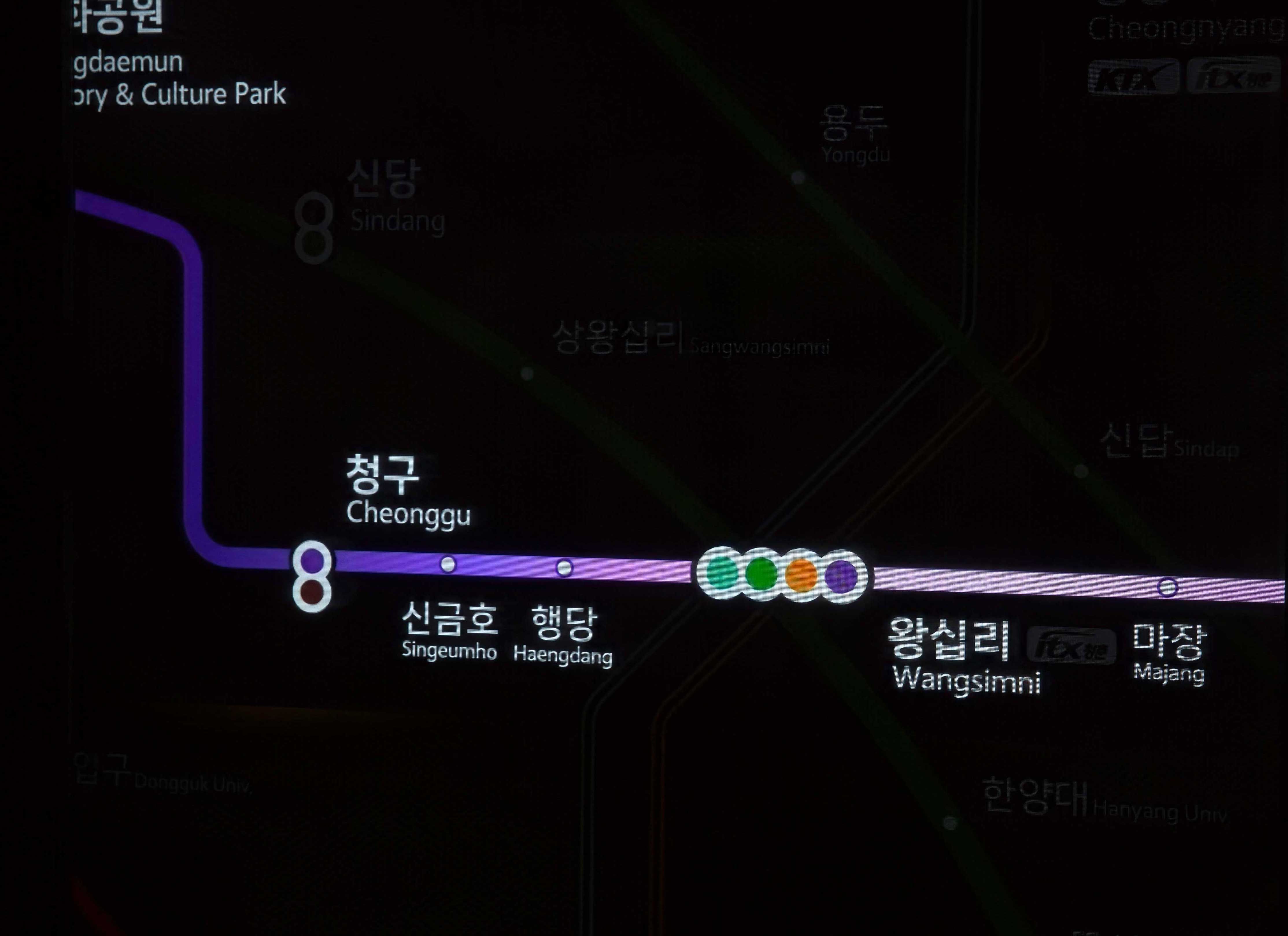
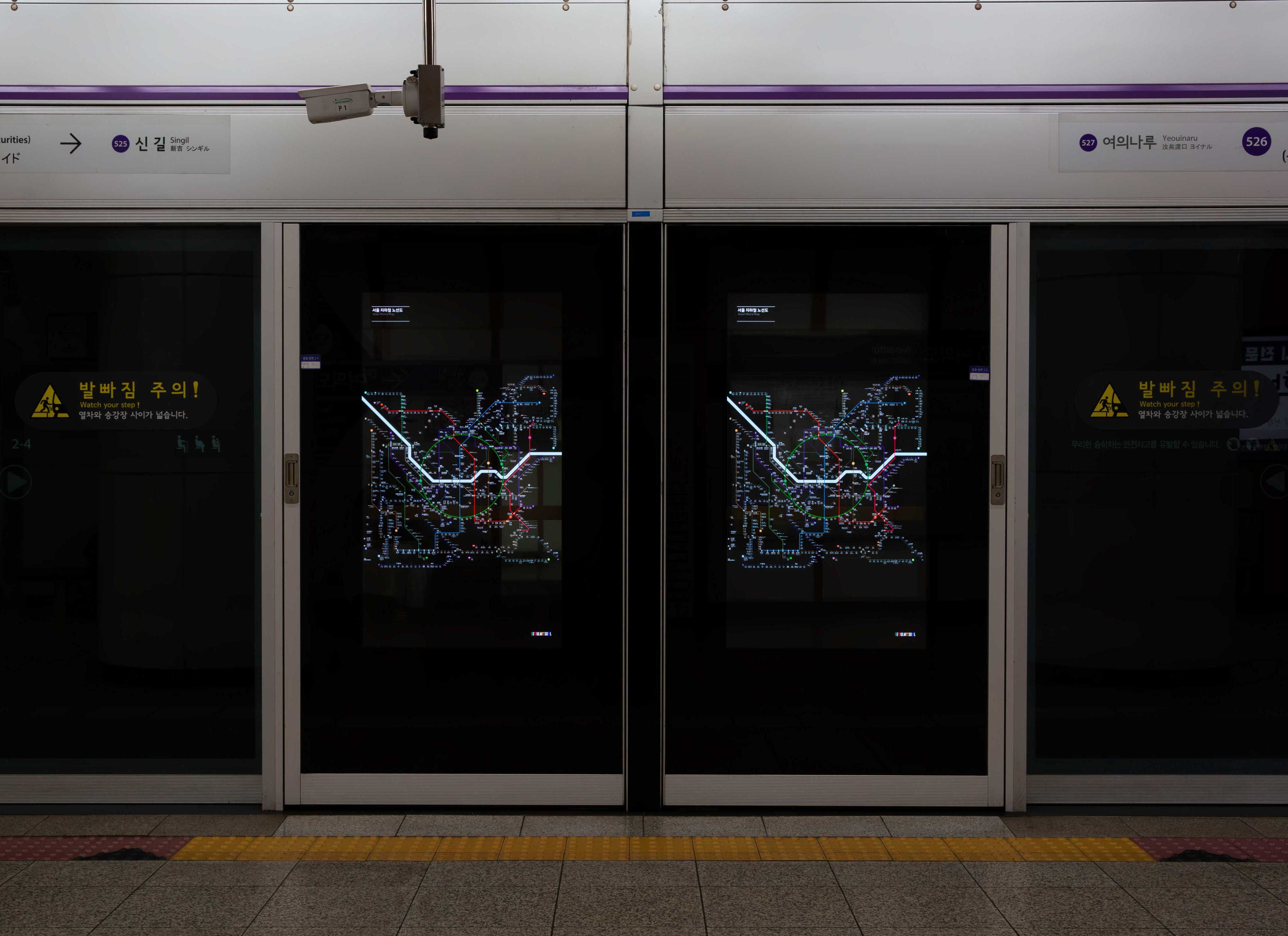
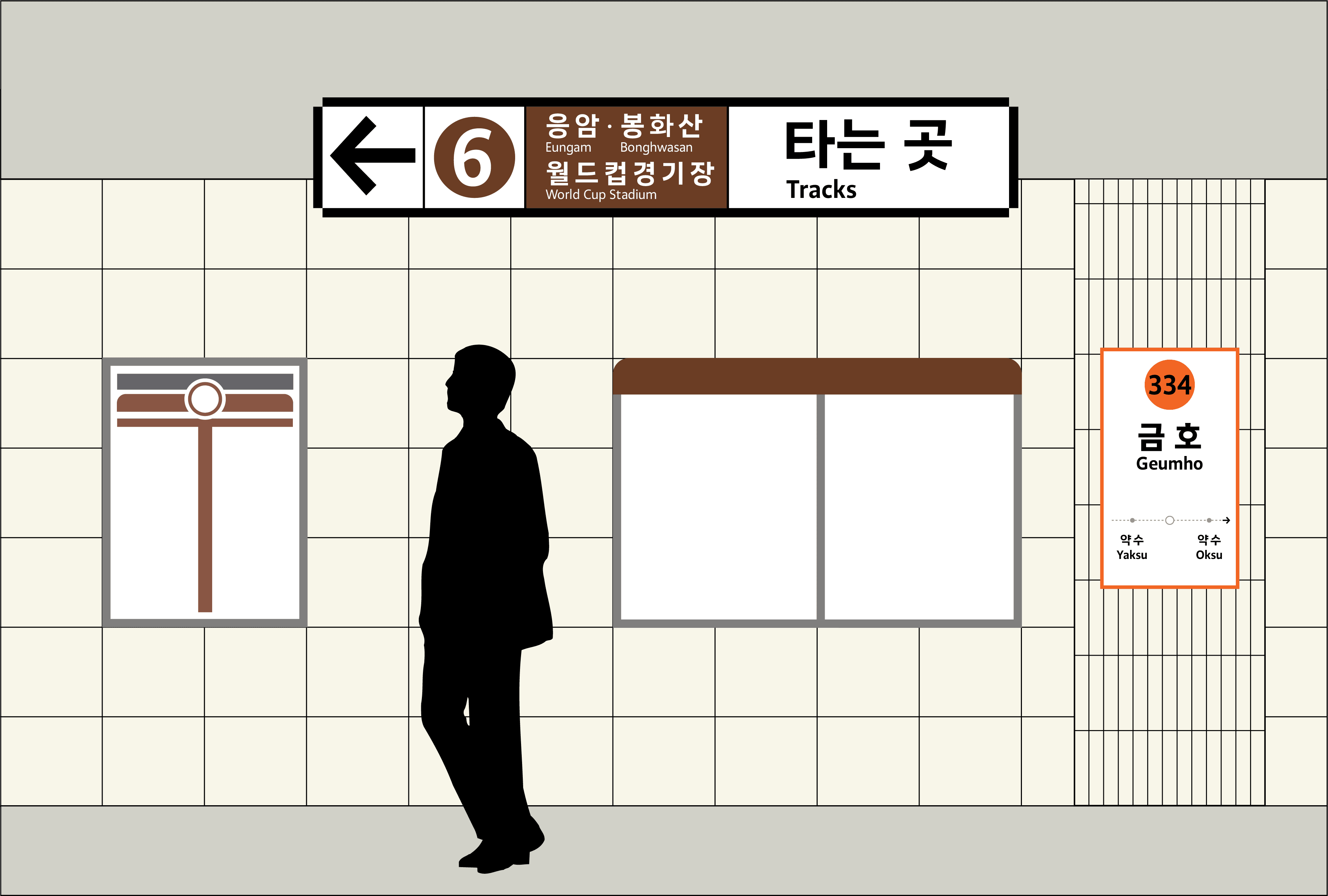
New typeface for the subway system, street signs, and buses in Seoul
We designed the new custom typeface for Seoul City in collaboration with the Tlab, South Korean type foundry. This collaborative project brought together our expertise in the Latin script and Tlab’s craftsmanship in Hangul, to create a unified type system for one of the world’s most dynamic metropolises. Seoul is a vibrant city with a population of over 10 million people. Its public transport system alone serves more than two billion users annually, making legibility and functionality essential for any typographic solution implemented across the city’s infrastructure. The brief we received from the city emphasized clarity, readability, and a humanist tone. The typeface would be used across various modes of public transport including subways, buses, and signage throughout the city.
Designing a typeface for a major city means creating something functional yet distinctive and enduring. During the research phase, we researched typefaces used in urban environments worldwide, focusing particularly on wayfinding systems and transport networks in other global capitals. During the development of the typeface, the Seoul subway map was redesigned for the first time in 40 years. Knowing that the Seoul Alrim typeface would feature in the updated map, we prioritized simplicity, clarity, and long-term usability from the very beginning of the design process.
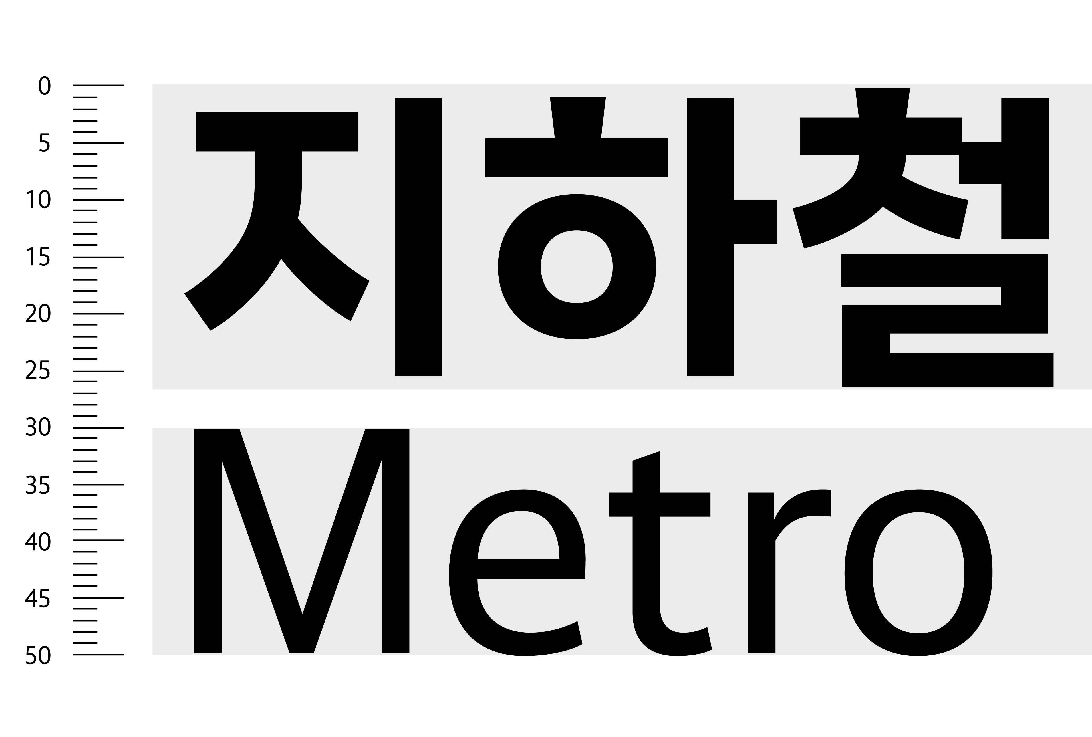
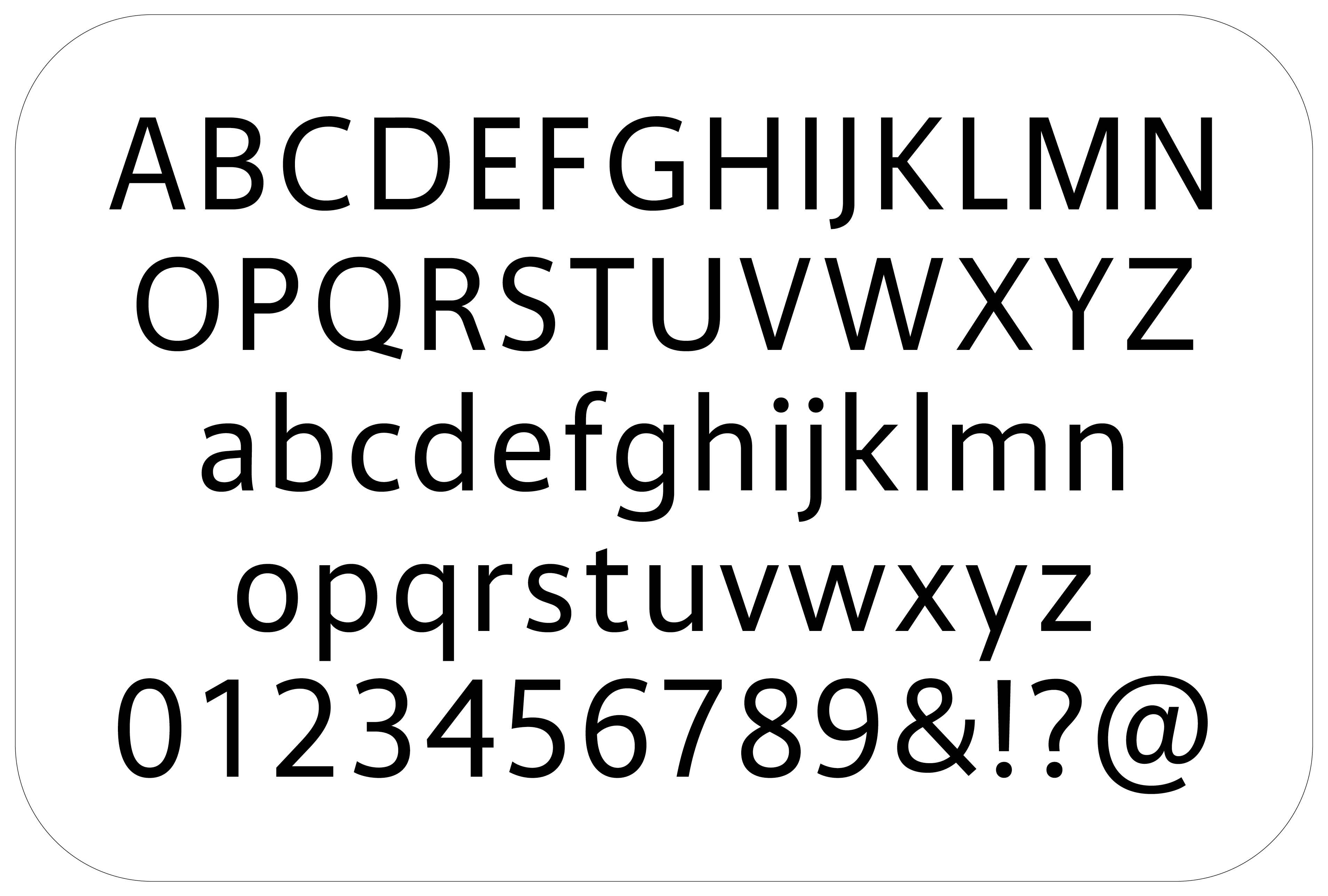
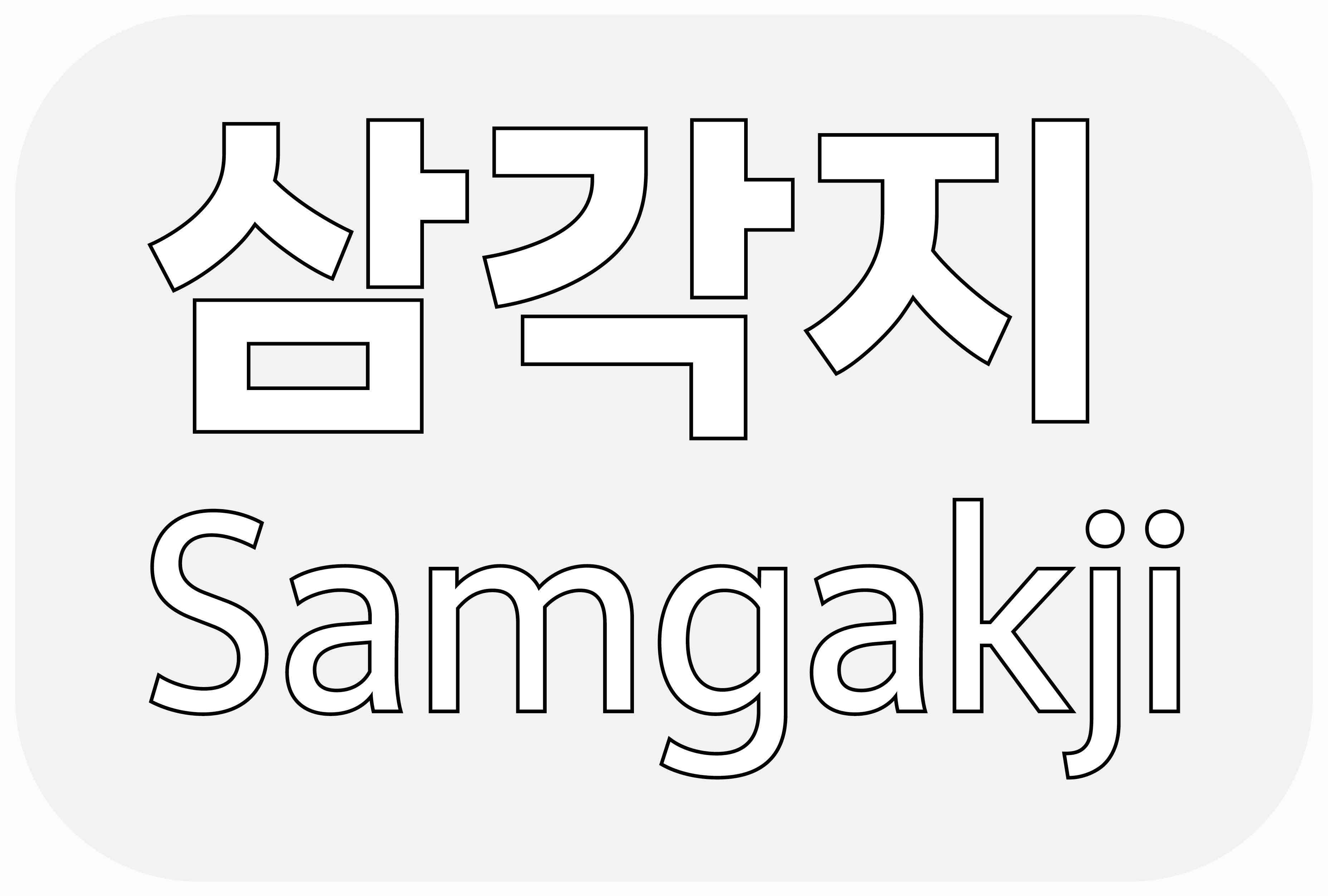
Tlab’s director, Yunjung Park, provided an initial sketch of the Hangul characters, which helped guide our approach to the Latin counterpart. We aimed to ensure that the design would balance well with the Hangul while also offering clear functionality for Latin users. Our aim was to ensure a visual harmony between both scripts, while maintaining the legibility and typographic integrity of the Latin characters. We explored a humanist style, with open counters, moderate proportions, and low contrast. Designing a typeface for a city like Seoul was both a unique opportunity and a meaningful challenge. Our goal was to create a system that is not only functional and accessible, but one that will stand the test of time, quietly supporting the identity and infrastructure of this remarkable city for years to come.
Credits: Latin designed by Edward Dżułaj, with contributions from by Nika Langosz Hangul designed by Yunjung Park, with contributions from Hansol Park and Jinhyun Park Visuals by Vincent Rheinberger & Edward Dżułaj Photography and videos by Jigaram Eo Client: Seoul Metropolitan Government